PHOTOBOOK REVIEWS, INTERVIEWS AND WRITE-UPS
ALONG WITH THE LATEST PHOTO-EYE NEWS

Social Media

Showing posts with label Alternative process. Show all posts
photo-eye Gallery Chaco Terada: Gallery Musings photo-eye Gallery photo-eye Gallery's staff is pleased to share thoughs on one of their favorite images by Chaco Terada.


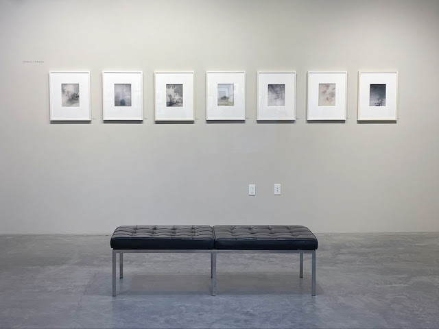
Since the 6th century, calligraphy has been a revered art form in Japan, following its introduction by Chinese masters. Today, it reflects the influence of Japanese Zen Buddist philosophy, where artists clear their minds to allow each character to arise spontaneously, committing it to paper in fluid motions. Yhohei Teradam, an esteemed calligraphy teacher at the University of Toyama, began teaching his daughter Chaco the art when she was only four years old. In her early twenties, Chaco would bring her passion for calligraphy to the United States and combine it with a new love: photography.

Chaco Terada has always been captivated by the way the lines of folded calligraphy paper showed through when held up to the light. Inspired by a poetry book that merged text and images, she developed a process that combines Sumi ink calligraphic mark-making with black-and-white photographic images printed on sheer silk, producing unique vignettes. Her subjects include landscapes, portraits, flowers and other imagery that is shrouded and obscured, their details blurred by layers of silk. Each layer of silk is then stretched between 8-ply matboards, like a canvas so that each semi-transparent layer of silk interacts with each other. The calligraphy is often painted on multiple layers, giving the impression of free-floating thoughts in the atmosphere. The spaced layers add depth to the images, and the silk adds an ethereal, atmospheric quality to the photos. 

Terada's brushstrokes derive from characters with multiple interpretations, creating impressionistic takes on mood and feeling. She says, "My calligraphy is influenced by life experiences. When I create a brushstroke, I think of the motion of water in a stream or the movement of a breeze. My lines do not create a word in the traditional sense; they interpret the meaning or mood that I feel the word represents."

>> To learn more about represented artist Chaco Terada, click here <<

>> To view more of Chaco Terada's work, click here <<


Gallery Director Anne Kelly and Gallery Assistant Jovi Esquivel share their thoughts on their favorite piece. To fully appreciate Terada's work and the interplay between the layers of silk, they should be experienced in person.


As the gallery director at photo-eye, I have the opportunity to form a relationship with the artists we represent, which includes hearing stories that are typically not included in general artist statements. These stories help provide a more complete comprehension of an artist's work, so I like to share them alongside experiences whenever possible.

Chaco Terada's relationship with photo-eye dates back about 15 years. Over this period I have thoroughly enjoyed getting to know Chaco, watching her career blossom and her art-making process evolve.

Chaco began producing art at age four when she began her studies in the ancient art of calligraphy. In her twenties, her calligraphy skills presented the opportunity to travel. Chaco eventually decided to settle in the United States, where she developed a passion for photography, which she began incorporating into her brushwork. In this new process, she moved away from traditional characters, which can be literally interpreted, into a new free-form version of calligraphy that she considers meditative mark-making. These marks benefit from a mastery of the ancient art of calligraphy but are not bound by traditional rules.

I would like to highlight Little Fox, for I see Chaco in all of her images but particularly this one. I perceive Little Fox, as a portrait of the artist, but not in the literal sense. Foxes, known as kitsune, often appear in Japanese folklore and are believed to have paranormal abilities such as shapeshifting. Chaco possesses many positive characteristics associated with foxes. Chaco is cunning, playful and resilient. 

This piece was made in 2020 when most of us were in quarantine. During this time Chaco revisited images from the past, looking for new inspiration. In this process, she came across a photograph that she had made of an Oragomi fox that was photographed on a trip to Japan the year prior and decided to work with that. The final image depicts the origami fox framed by silhouetted foliage. The origami fox appears to be looking out a window and dreaming of returning to the forest to play. 

Because Chaso's images are composed by stacking multiple layers of semi-opaque silk, the individual elements become one, they are capable of representing not just one moment in time but multiple places within the same frame. Her past, present and future are illustrated in a single image.

—Anne Kelly


Chaco Terada, Sounds of Silhouette, Sumi & Pigment Ink on Silk, 10 x 7½ Image, Unique Object, $1800

I feel a profound connection to the wind, which beckons me to dream and awakens all of my senses. Living in New Mexico, I cannot escape the dramatic interplay of light and sound shaped by the forceful will of the wind as it moves through the tall Cottonwood trees. The artwork titled Sounds of Silhouette amplifies this connection for me. The work appears to be a vignette of leaves and branches that have been printed on multiple layers of silk, creating a sense of depth and varying densities that mirror the way light moves through trees. Against this backdrop of light and shadow, Chaco's hand emerges with iridescent calligraphic strokes, capturing the essence of wind whispering through leaves.

Chaco's process of combining calligraphy with photography on silk produces an otherworldly quality that draws me into the artwork and makes me feel connected to the natural world. 

—Jovi Esquivel


If you are in Santa Fe, please stop by during gallery hours or schedule a Virtual Visit here.


*      *      *

Print costs are current up to the time of posting and are subject to change.


For more information, and to reserve one of these unique, extraordinary new works,
please contact photo-eye Gallery Director Anne Kelly 


1300 Rufina Circle, Unit A3, Santa Fe, NM 87507
Tuesday– Saturday, from 10am– 5:30pm

You may also call us at (505) 988- 5152 x202


photo-eye Gallery Beth Moon - The BAOBAB Interview Anne Kelly
This week, Gallery Director Anne Kelly sits down with Beth Moon to learn more about her stunning book project and online exhibition, BAOBAB! Hear about Beth's photographic journey through the African continent here!
Beth Moon, Tsikakakantasa Reflection, 2018/2022, Platinum print, 18x27", Edition of 15, $3800

Beth Moon is inspired by the natural world, like many photographers. However, Moon treats all of her explorations as a portraiture project. She isn’t simply documenting -- the goal is to connect with her subject and to share that experience with the viewer. Knowing this, I wasn’t surprised to learn that Moon was returning to Africa in 2018 to re-visit a former subject, this time, a specific Baobab tree, that was in the process of toppling over. It was Moon mission's to share the story of the Tsitakakoike Tree and other Baobabs that she encountered on the journey. 

In 2021, Moon’s “Baobab” project was released, including a collection of platinum prints and a book by the same title as well as an online exhibition at photo-eye. The book includes text from Moon’s personal journal which assists in telling her story and calls attention to the impact of drought on Baobab trees that have historically had a life span of 2500 years.

In honor of this new project, I caught up with Beth to discuss her affinity for trees, her 2018 pilgrimage, and more...

Enjoy!

— Anne Kelly, photo-eye Gallery Director


*************


Anne Kelly, Gallery Director at photo-eye (Credit: Dave Hyams) & Beth Moon


Anne Kelly, Gallery Director (AK): Your mission to photograph the oldest trees in the world began about 20 years ago. What is the origin story of this exploration, and did you anticipate that it would end up spanning over decades?

Beth Moon (BM): The first ancient tree that I visited was in 1999. I drove about an hour outside of London to a churchyard in Surrey to see this extraordinary yew tree whose presence could be felt throughout the cemetery. But I didn’t return with a photograph. I was so overwhelmed; all I could do was sit in front of the tree and stare in complete amazement.

In time I was able to harness my excitement into taking photographs, but I had no idea that I would continue to do this work 23 years later. Of course, I have been interested in exploring other work though out that time, but I always seem to be pulled back into the realm of trees. Either someone tells me about an amazing tree, or I will read an article. It appears there is no escape!

AK: And why would you want to escape!? Your tree exploration has taken you to many places, including Africa, a few times. The most recent trip was a “pilgrimage to visit a tree” that you had photographed in the past, that was in the process of tumbling. On receiving the information, I get the impression that you made the decision to return as soon as possible and that you made the decision very quickly. It wasn't a matter of if, but when. Is that pretty accurate, and can you expand on that?

BM:I had taken various trips to Botswana, South Africa, and Namibia as the oldest trees are mostly found in the southern hemisphere, and traveled to Madagascar three times.

Yes, when I was told the tree was dying, I knew it would be a matter of a few weeks at most before the entire tree would come down, so I had to act fast. This meant traveling during the rain and cyclone season and that came with its own set of obstacles!
Beth Moon, Zebu cart, NFS

AK: Like most things that are worth doing, nothing about your voyage was easy – from five days of travel to the storm that you arrived in. The original plan to travel to the Tsitakakoike Tree by car had to be rethought – and you ended up traveling by cart, pulled by large African cattle -- yet, another testament to your dedication. Do you think the modified method of travel change the project?

BM: What at first was seen as a deterrent, actually turned into a positive. Large pools of water were too deep to drive through, but amazing African zebu can traverse the water without difficulty. By taking alternative routes into the forest, we discovered trees of important stature that local villagers had not seen before.

AK: This makes a lot of sense – much like opting to travel on a two-lane highway, as opposed to a superhighway or airplane! What was the most exciting or surprising encounter that you had based on this method of travel?

BM: I’d like to use an excerpt from the book for this.
I have asked the chief for permission to stay overnight in the forest…An unfamiliar sound jolts me from sleep. I sit up in complete darkness and remember my headlamp is still on my forehead. Fear is the length of time it takes my eyes to adjust. A flash of light illuminates a couple of dozen pairs of eyes before me. A surprised herd of zebu, looking for a place to settle down for the night, stares back at me.
The rhythmic sound of snoring zebu nearby lulls me back to sleep.
Beth Moon, Zebu panorama study, NFS

AK: Would you opt for this method of travel again, in the future, even if not necessary?

BM: By surrendering I was able to come to grips with so many things out of my control, and ultimately able to trust spontaneous outcomes. Being forced to slow down and appreciate the view along the way is not only a good metaphor, but a good lesson!

AK: You described seeing the Tsitakakoike Tree in partial collapse as a mix of “astonishment and horror”. I can only imagine what that must have felt like. Was photographing the tree a cathartic experience?

BM: Standing in front of the destruction of this tree, was a life-changing experience in a way that I cannot describe in words. Largely, the project was just about bearing witness.

Upon returning home, I had a mixture of anxiety and grief that consumed me. Directing my energy into the book felt cathartic. Writing the text, organizing information, and sharing images of the trees allowed me to reveal the plight of the trees to others.

Beth Moon, Tsitakakoike, Andombiry Forest, 2018/2022, Archival pigment print, 40x80", Edition of 5, $12000


AK: I love how the text in the book reads like a journal – and how the text is interspersed between the images. Can you talk about that, and the design of the book as a whole?

BM: On trips like this, I usually write in a journal as a way of keeping track of day-today details. Professor Patrut and his team have been radiocarbon dating the oldest trees for the last decade and through this study, they learned just how fast the ancient baobabs were declining. I thought there was great value in this scientific research, but the information felt dry and clinical. Weaving a story of my personal experience around the data was the reason to make the book, so the journal entries became the backbone.
Beth Moon with Baobab tree, NFS
I usually prefer to see images without the clutter of text, but it felt more compelling to intermingle the images around the story, similar to a travel book. I hoped to bring the reader on the journey in this way. Enlarging certain phrases took the place of captions.

To differentiate between the platinum portraits, I hand-colored the travel photos and did not mask the edges, which were also platinum prints. Many of the tree portraits were panoramic and single frames were at a 2:3 ratio. There is always a fine balance between using the highest quality materials while staying within a reasonable retail price. Price also dictates book size, so I was pleased when my editor accepted my 10” x 15” book suggestion that would make the most of this format.

AK: I hear you, pairing text with images can be a challenge, but I think it was the right call in this case – it adds to the experience of viewing the book. The text that you wrote is anything but dry.


Regarding your printing process, it would be great if you could touch on that. I have an affinity for the printing process, however, it is labor-intensive and costly. For you, what keeps your black and white work rooted in this process?


BM: I guess I remain true to my original thought when I first started this series, “a platinum print can last for centuries, drawing on the common theme of time and continuance, pairing photographic subject and process.”


However, I am also making prints with pigment inks of the panoramic images on a large scale to emulate the sheer size of the trees and landscape.


AK: What is next for you?


BM: I never like to talk about new projects because sometimes they don’t gain enough momentum to be fully actualized, but more often the reason is that I usually sit on projects for years before they are finished.  Often, I like to look at work months later, hopefully with new insight and inspiration


For example, I was going to the coast for a couple of years photographing ravens, not really thinking this would amount to a series of work, but one day I happen to remember the Norse god Odin, that had two ravens. Odin’s Cove!  That element spoke, not only of the birds but the beautiful coast where they lived and it formed a structure to bind all the elements together. I continued to photograph the birds with a larger focus.


AK: And lastly, sweet or salty? What is your favorite dish from all the places you’ve traveled?


BM: I should probably point out that most of the places I go are not known for their culinary expertise.   However, having fresh fish from the Arabian Sea cooked on an open fire in the Frankincense Forest does stand out in my memory.  My guide was also able to make flat bread baked on a hot stone, drizzled with honey and strong Mokha coffee.  All of this with two pots!


Beth Moon, BAOBAB III, Ankoabe Forest, 2018/2022, Platinum print, 24x36", Edition of 5, $7000


Beth Moon, Branches, 2018/2022, Platinum print, 18x27", Edition of 15, $3800

Beth Moon, BAOBABS VI, Andombiry Forest, 2018/2022, Platinum print, 18x36", Edition of 5, $7000


BAOBAB by Beth Moon.
https://www.photoeye.com/bookstore/citation.cfm?catalog=AV103


>> View the online exhibition of BAOBAB <<

>> Signed copies of BAOBAB in the photo-eye Bookstore <<

>> Read more about Beth's practice of photographing trees! <<


• • • • • 
 
Print costs are current up to the time of posting and are subject to change.

photo-eye Gallery is proud to represent Beth Moon.

For more information, and to purchase prints by Beth Moon, please contact Gallery Director Anne Kelly or Gallery Assistant Delaney Hoffman, or you may also call us at 505-988-5152 x202

Kate Breakey, Dried Orchid in Jar, Archival pigment print and 24k gold leaf, 6.5 x 5.5", Edition of 20, $1200 (Framed)

photo-eye Gallery is thrilled to present a selection of new images of orotones from Kate Breakey! The artist has been working with this process continuously throughout the last twenty years and all of these pieces are available to view in the gallery.

Kate Breakey is an artist who likes to take her time. Over the last four decades, the artist has amassed an impressive and intricate body of work; from delicately embroidered images printed on silk to the hand-painted negatives that she is known for, Breakey applies a razor-sharp eye for detail and aesthetic harmony to every process that she approaches.

One of the methods of working that Breakey is known for is the orotone. If you were to break it down, an orotone is exactly what it sounds like — an image that is granted luminescent tonality through the use of gold backing. This process is historic with roots in the early history of photography. It was used and refined by the studio of Edward S. Curtis (an inspiration of Breakey's) throughout the mid-1800s; he's often credited as one of the most important innovators of the technique. Breakey's updated technique, which involves producing images on glass plates with an inkjet printer (which are then backed with 24k gold leaf), achieves a similar tonal effect as that of  Curtis'. Breakey allows for her subjects to double as specimens (or stand in as constructed tableaus) and this, too, feels like a nod to some of the early uses of photography as a means of documenting the formal qualities of objects in the natural world in the same vein as Anna Atkins' cyanotypes. 

Though her focus spans the natural world, Breakey's orotones are all photographed in a way that echoes paintings from Dutch and Flemish antiquity. The golden glow emitted by these images draws attention to the subtle beauties in our day-to-day life that hearken back to classical or neo-classical aesthetic principles. The results of her approach are a plethora of images that are beautiful as well as timeless, take a look at more of the orotones that we have on view below!

Kate Breakey, Blue Vase, Red Berries, Archival pigment print and 24k gold leaf, 8.5 x 4.5", Edition of 20, $1200 (Framed)


Kate Breakey, White Koi, 2014, Archival pigment print and 24k gold leaf, 6 x 7.5", Edition of 20, $1170 (Framed)

Kate Breakey, Sprouting Onion, Archival pigment print and 24k gold leaf, 5.5 x 4.5", Edition of 20, $1170 (Framed)

Kate Breakey, Horny Toad Lizard, Archival pigment print and 24k gold leaf, 6.5 x 5.5", Edition of 20, $1200 (Framed)

• • • • • 
 
Print costs are current up to the time of posting and are subject to change.

photo-eye Gallery is proud to represent Kate Breakey.

For more information, and to purchase prints by Kate Breakey, please contact Gallery Director Anne Kelly or Gallery Assistant Delaney Hoffman, or you may also call us at 505-988-5152 x202


photo-eye Gallery New Works from Kate Breakey Delaney Hoffman
This week we're highlighting some beautiful loose prints that have recently arrived in the gallery from represented artist Christopher Colville. Colville is known for his spontaneous compositions made by exploring the possibilities of gunpowder as a photographic tool. Learn more about this process-oriented work and see what's available to view below!
photo-eye Gallery Fresh in the Flat Files: Works from Christopher Colville Delaney Hoffman
This week we're highlighting some beautiful loose prints that have recently arrived in the gallery from represented artist Christopher Colville. Colville is known for his spontaneous compositions made by exploring the possibilities of gunpowder as a photographic tool. Learn more about this process-oriented work and see what's available to view below!
Christopher Colville, Stilbon II, Contact print on direct positive paper, 4x5", Unique, $1100

This week we are ecstatic to share prints from Christopher Colville that are now available for viewing at photo-eye Gallery!

Christopher Colville is an artist and educator born and now based in Phoenix, Arizona. From the beginnings of his photographic career, Colville has been interested in the material aspects of the medium that have the potential to transcend traditional representation or pictorial photographs. 

The images from the second portfolio of FLUX is comprised of camera-less imagery made between 2011 and 2020. In place of the negative, which is traditionally used in contact printing to produce an image on photo-sensitive paper, Colville utilizes the light and heat generated from gunpowder to expose the material instead, resulting in unique artworks that speak to the inherent coexistence of creation and destruction.

Christopher Colville, Untitled Triptych, 2020, Contact print on silver gelatin paper, 7.5 x 17", Unique, $4000

Many of these pieces included in this collection are the result of the artist's meditations on the natural world. After moving to Phoenix full time, Colville felt compelled to engage in the tradition of landscape (both terrestrial and interstellar) representation in Southwest, but wanted to do so in a way that broke the traditional framework.

The desert offered material as well as aesthetic inspiration for the artist. Discarded targets and shotgun shells found outdoors at community shooting ranges provided conceptual fodder for the project, Beyond Reckoning, and Colville would take breaks from this conceptually loaded work for the material examinations included in FLUX 1 and 2. These images are entirely centered on process and experimentation and feature invented constellations, horizon lines, and organic curves created with modified blades.


Explore more prints from the series below and pop into the Gallery to see these incredible works for yourself — we even have a Virtual Visit option for our friends outside of New Mexico.


Christopher Colville, #14 From Constellations, 2011, Contact print on silver gelatin paper, 4.5 x 3", Unique, $1000


Christopher Colville, Untitled W.O.F 15-41, Contact print on silver gelatin paper, 8 x 10", Unique, $1450


Christopher Colville, Untitled W.O.F .09-07-13, Contact print on silver gelatin paper, 6 x 4", Unique, $1250


• • • • • 

 
Print costs are current up to the time of posting and are subject to change.

photo-eye Gallery is proud to represent Christopher Colville.

For more information, and to purchase prints by Christopher Colville, please contact Gallery Director Anne Kelly or Gallery Assistant Delaney Hoffman, or you may also call us at 505-988-5152 x202


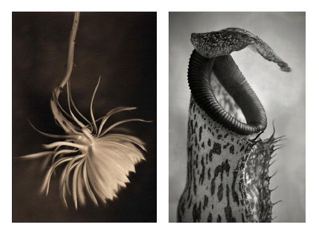
Left: James Pitts, Night Blooming Cereus, 1999, Platinum Palladium Print, 5x4", Edition of 25, $1000
Right: Beth Moon, Nepenthes Coccinea, Platinum print, 7.5x5", Edition of 9, $900 


In celebration of the spring season, we have installed a selection of Platinum prints focused on floral still lives from gallery artists Beth Moon and James Pitts.

You may be wondering, upon reading the opening sentence of this week's post, what is a platinum print anyway? To that I say: fantastic question.

Platinum printing is a method that uses light-sensitive platinum (as opposed to silver in "traditional" darkroom printing) to make a picture! This printing methodology dates back to the late 1800's and is known for being a process that has the potential to produce an incredible tonal range as well as to achieve archival permanence. When making a platinum print, the image is produced by placing a negative on top of paper coated with a photosensitive solution and then exposing that paper to light; this process is referred to as contact printing and is notoriously difficult to do well (for more in-depth descriptions of alternative processes, check out this article!).

James Pitts and Beth Moon are two who have mastered this laborious workflow through years and years of diligent practice. Their mastery is apparent, and though the overall practices of the two artists are wildly different, they converge in floral formalism.

Beth Moon's plant portraits are from her portfolio entitled The Savage Garden. This work serves as an investigation of the formal beauty of carnivorous plants. Moon's images don't treat these plants as our culture often does, with some element of novelty and exoticism, but instead highlights their supple curves and delicate structure. This attention to detail and composition is mirrored in the platinum works of James Pitts, who has been making still lives of flowers for well over twenty years as meditative studies of light and form. In Pitts' work, the flower is simply the vehicle for serene expression. 

Take a sneak peak at what's up on the wall below and explore more work from Beth Moon and James Pitts as well!

>> Beth Moon Interview <<

>> James Pitts on his Platinum printing origin story <<


James Pitts, Wild Poppy with Seed Pod in Girard's Vase, 1996, Platinum Palladium print, 5x4″, Edition of 25, $1000

Beth Moon, Nepenthes Bicalcarata, Platinum print, 12x8″, Edition of 15, $1200

James Pitts, Digbyana, Platinum Palladium print, 5x4″, Edition of 25, $1000

Beth Moon, Nepenthes Ventricosa, Platinum print, 12x8″, Edition of 15, $1200


>> Explore Beth Moon's online exhibition, BAOBAB, here! <<


>> See more portfolios from James Pitts here! <<

• • • • • 

Print costs are current up to the time of posting and are subject to change.

photo-eye Gallery is proud to represent Beth Moon and James Pitts.

For more information, and to purchase prints by Beth Moon and James Pitts, please contact Gallery Director Anne Kelly or Gallery Assistant Delaney Hoffman, or you may also call us at 505-988-5152 x202

photo-eye Gallery On View - Platinum Florals from Beth Moon and James Pitts Delaney Hoffman
In anticipation of warmer weather and lots of pollen in the air, we've installed a stunning selection of floral platinum prints from Beth Moon and James Pitts in our gallery space! Click here to see some of the work and to learn more.
photo-eye Gallery On View - Prints from Linda Connor Delaney Hoffman
It's a new year, and so it's time to switch it up! We're thrilled to announce the installation of a selection of Linda Connor's unique Printing Out Paper prints in the gallery. Stop in and check them out!


Linda Connor, Morning Light, Nako, Spiti, India, 1994, Contact print on Printing Out Paper - Gold Toned, 8x10″, $3500

Linda Connor is what most would consider to be well-traveled. She and her 8x10″ view camera have trekked through the sloping foothills of the Himalayas, across the Andes, along the Ganges River and across the deserts of the Southwestern United States. Along the way, she has photographed the people and the places that have inspired joy, poetry or reverence, she has spent time in astronomical archives making contact print after contact print of our first glimpses of outer space, and she has inspired many students throughout her career as an educator at the San Francisco Art Institute.

We are thrilled to announce the installation of a few of Linda Connor's images in our physical gallery space. Her importance as an artist and educator cannot be overstated, however Linda prefers to align herself with the identity of a "visualist". As the artist says, "...the way that images convey their forms and meanings is my most fluent language — both in how they speak to me and how I wish their presence to convey to others." This is to say that Linda Connor's pictures speak to her and to us, her audience (which is to be expected in photography), but also to each other.

The prints that have taken up residence on the photo-eye Gallery wall are all included in Linda Connor's newest book, Constellations, which manages to present a collection of images that span both regions and years. Despite the physical distance that separates the plates included in the book, they manage to converse amongst themselves. Flipping through the book puts you in the middle of an ongoing dialogue between the present and the past; between what is happening in front of the artist, and what has happened light years ago.

View a selection of prints from this work below, and make sure to stop into the gallery to see the beautiful, unique warmth of Linda Connor's gold-toned images in person!


Linda Connor, December 21, 1989 from the Lick Observatory Archive, Contact print on Printing Out Paper - Gold Toned, 7x5″, $3500

Linda Connor, Cloud Shadow, Ladakh, India, 1988, Archival pigment print, 22x28″, $3500

Linda Connor, Orion Nebula, January 21, 1938 from the Lick Observatory Archive, Contact print on Printing Out Paper - Gold Toned, 7x5″, $3500

Linda Connor, Earth and Sky III, Queensland, Australia, 1997, Contact print on Printing Out Paper - Gold Toned, 8x10″, $3500

>> View Constellations in the photo-eye Bookstore here <<

>> Learn more about Linda Connor! <<


• • • • • 

Print costs are current up to the time of posting and are subject to change.

photo-eye Gallery is proud to represent Linda Connor.

For more information, and to purchase prints or books by Linda Connor, please contact Gallery Director Anne Kelly or Gallery Assistant Delaney Hoffman, or you may also call us at 505-988-5152 x202