photo-eye Gallery Fluid Documents– An Interview with Diana Bloomfield
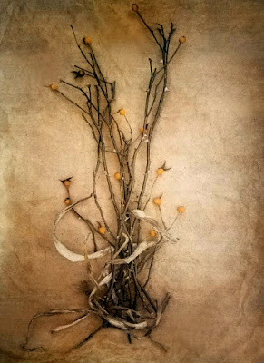
photo-eye Gallery welcomes Diana Bloomfield to the Photographer's Showcase with The Old Garden, a portfolio of labor-intense tricolor gum bichromate prints featuring delicate images of floral specimens.
Diana Bloomfield's photography looks and feels different than the majority of camera-based work today. Her labor-intensive tricolor gum bichromate technique, which requires precise registration and multiple layers of exposure to create each individual image, imbues her prints with a feeling of tactile object-hood. Her color palates range from muted earth tones, to bright flashes of yellows, greens, and blues, to delicate pastels and sepia tints. Documentary in spirit, and fluid in expression, the work feels like a gentle nod to the past in both process and subject matter.
 |
Diana Bloomfield in her studio, developing an image
in her signature tri-color gum bichromate technique
|
Bloomfield’s series
The Old Garden, featuring delicate images of various floral specimens from her own yard, is the newest addition to photo-eye Gallery’s online Artist Showcase. photo-eye Gallery Director Anne Kelly met Bloomfield at the PhotoNOLA portfolio review earlier this year, and felt drawn to her work and mastery of uncommon analogue practices. photo-eye recently had the opportunity to speak with Bloomfield about her work and process:
photo-eye: In your artist statement you talk about the photograph’s relationship to time, and how each image that you document, regardless of subject, is preserved in the past. Can you speak more about what draws you to these acts of documenting, remembering, and looking to the past?
Diana Bloomfield: While I do try to live in the present, I’m consistently aware that whatever I’m doing, wherever I am at any given moment, whatever conversation I’m having— all of that is also passing me by, almost simultaneously. As soon as the moment is here, it’s gone. For me, the past and present are always colliding. So I make these visual documents in an attempt to preserve those moments that, for me, jog some memory or visually make a connection to my past. It’s never preserved exactly as I saw it, of course, because the memory of the scene itself is fluid and may never jibe with the actual experience, or even in the way the image is ultimately printed. I try to preserve what I saw in my mind’s eye, though, much like keeping a visual diary. Whatever I photograph is of value to me in some way, so I document and preserve that moment in time. The entire process seems elusive, but a visual document works to honor and acknowledge both my past and my present. And if the images ultimately resonate with others in some meaningful way, then that’s a bonus.
p-e: Even your process evokes the past in method. There is meticulous, physical labor that goes into creating each image. Can you explain your method in a bit more detail?
DB: Although I do work in several printing processes, my process of choice is tricolor gum bichromate. It’s the only process I’ve ever used that hasn’t bored me after a while, and that’s because the creative possibilities appear truly endless. This is a 19th-century process that involves an emulsion of watercolor pigment, gum arabic, and potassium (or ammonium) dichromate. I use watercolor paper as my substrate. Gum dichromate is a short tonal range process, so the first goal— before ever printing— is to manipulate the image on-screen so that a long tonal range can be achieved in the final print. I do that by uploading my onscreen color image to the computer, and applying a curve that offers a flat, low contrast image. After applying the curve, I separate the image, onscreen, into CMYK (cyan, magenta, yellow, black) negatives. I then print those CMYK separation negatives, using digital transparencies.
My first layer is often the C (cyan) layer, since that’s the darkest of the pigments and creates a good strong base on which to re-register the subsequent layers. I often cross-process and substitute cyanotype as a base— a totally different 19th c stand-alone process— that meshes well with gum bichromate, because the two processes use the same curve. If using gum bichromate for that first layer, I mix a specific emulsion of watercolor pigment, gum arabic and potassium dichromate, pour it on the paper, and brush-coat it to the size of my image. That dries in the dark, and once dry, I lay down the C (cyan) negative on top, and expose to UV light. Although the sun is a free source of UV light, it’s inconsistent, so I use a UV vacuum print frame. That layer I’ve just exposed, typically for about 5 minutes, requires washing in a water bath for about an hour. That allows the dichromate to leach out of the paper, the whites to clear, and everything that is blue in the image remains, while the rest washes out. Once that layer is removed and dried, I then coat that very same print with a black pigment and perform the same routine, this time registering the black negative over top of that black pigment and the cyan layer I’ve already printed. Again, that requires washing, and everything that isn’t black (mostly deep shadow detail) washes out. Some people use registration pins or some other method to ensure perfect registration, but I simply register by eye. I find it easier. I go through yellow and magenta in the same way.
Generally, my prints are anywhere from 5 to 11 layers. Applying so many layers, I do alter the ratio of gum to dichromate to pigment, every few layers, to avoid any muddiness. In the end, what remains is basically an archival print that is watercolor pigment encased in hardened gum arabic. Each print can certainly take several days to a week to make.
That’s the short version of this process, but it does require a sense of knowing how colors work, and how they work together, and an awareness of what ratios and pigment mixes can do to achieve what you want, and also just knowing when to stop.
p-e: Can you talk more about why you use this method, or how you feel that it conveys your concepts and interests better than other processes?
DB: The gum bichromate process is often unpredictable and certainly rife with variables and surprises, frustration and heartache. But when it works, there’s nothing quite like it. And, for me, those surprises and unpredictability make it all the more fascinating.
The repeated layerings are meant to add a tonality and a saturated richness, yet each layer added also serves to remove all the hard, clearly defined edges and sharp clarity. I like that in my images. Softness and ambiguity results-- even in the colors—much the way we see and remember. In that way, this process meshes with my images, which are almost always first seen in my mind’s eye— and that’s never a clear sharp vision. The process itself, where total control is elusive, yet filled with possibilities, also seems a lot like life.
p-e: Your statement also mentions the act of opening and closing the shutter to create an image as making a statement... and indeed, to choose to capture something in camera is to confer importance on that thing.
DB: I do consider the act of photographing as a way to preserve both the present moment, and certainly when looking at the photographs later, the past. For me, those images are akin to a visual diary, but one that is less about what happened during my day, and more about what I might have had in my mind at any given time.
p-e: How do you choose your subject matter for the images you make?
DB: I tend to work in series, rather than singular photographs. So I have various bodies of ongoing work, some that began decades ago, that still hold my interest and that I continue to grow. Others, like
The Old Garden series, began more recently. Something about the subject matter that I see or that I’ve been thinking about, evokes a memory and connection for me. And I try to put that to paper. I also have a continuing figurative series that I began of my daughter, Annalee, twenty years ago. That’s very much a collaborative effort, where she seems to intuit what I’m looking for in an image— and this work is an ongoing narrative.
p-e: How does narrative or storytelling play a role in your work?
DB: I do have a running story in my head about each of these different bodies of work. I like to think that each image can exist as a stand-alone narrative. That is, viewers could see an image, and it might evoke certain memories of their own and easily enable them to weave their own unique story around that one image. However, the images are generally meant to work together as a larger and, for the viewer, a wholly interpretive narrative.
p-e: Do events from your own past ever make their way into your subject matter?
DB: The Old Garden series certainly overlaps the past with the present in a visual intertwining of my grandmother’s urban Southern garden with my own. Mostly, though, that overlapping of past and present is less overt. But certainly, I don’t think any of us can create without the past intruding into our work. My past totally shaped me and informs how I see and experience the world, so to have my past somehow not make its way into my subject matter seems unavoidable.
p-e: It seems like playing with pinhole cameras, long exposures, and other more experimental formats and processes are also important to your photography practice.
DB: Yes; the one problem I’ve always found with still photography is that it is, in fact, so still. I love the fluidity of moving films, and short of going into film-making, I find pinhole cameras, with their long exposures and skewed perspectives, offer a similar type of fluidity and movement. In a slightly different way, toy cameras also offer that softness and fluidity. This is true for the tricolor gum process, too. So I use those tools to exploit that softness, ambiguity, and sense of movement and nuance. And I prefer the unpredictability inherent in each.
p-e: Can you talk more about how unpredictable outcomes or relinquishing control over the final look of an image-making play a part in the work?
DB: I always feel I’m at my creative best when total control is just out of reach, and a certain unpredictability is a constant. I love the surprises, the promise of discovery, and, most especially, the challenge. I work and print in an intuitive way, and all the tools I use easily play into that. I have an idea about how I want a print to look, but I also want to remain open to the possibilities. Those possibilities can often lead to something new and exciting that I had never even contemplated.
p-e: Color is used in a wide variety of ways in your work. How do you approach handling color when you make a photograph?
DB: I’ve always loved the fugitive and dynamic nature of color, which never remains constant, but shifts and transforms with the light, and the quality of that light. Consequently, I’ve never really cared that a scene or figure was perfectly aligned with what I saw, because what I actually saw shifted in front of me, and, once in my mind, also remains fluid. So I try to exploit color in the way I saw and remembered it— often two different experiences— while also maintaining the luminous nature of it on paper, which is not easy and not always successful. To do that, I use thin layers so that all the colors might interact with and shine through the previous layers.The goal, for me, is to create depth, while maintaining a translucence. My combination of watercolor pigments and their repeated layerings work to offer a suggestion of color and hues, rather than something specific and identifiable. I’m also aware that color is extremely seductive, so while color may be the thing that initially draws in the viewer, the image itself is what I want people to experience. So I try to create images that could just as easily stand on their own in black and white. I think about that a lot, even when I look at other photographs. I try to ensure the color works in tandem with the image, rather than being the center, or what holds it all together. Also, in my experience, watercolors often seem a bit too happy, so I also tend to print relatively dark— while still maintaining detail — so that a particular mood is created.
p-e: photo-eye's Gallery Director, Anne Kelly, met you at PhotoNOLA, and recalls that you were well prepared and did an excellent job presenting your work. Tell us about your experience at PhotoNOLA, and what advice you might have for other photographers who are thinking about attending a portfolio review?
DB: Thank you, and I so enjoyed meeting Anne and talking with her there. PhotoNOLA was the first big portfolio review I had ever participated in, and it was a great experience. I actually got to see all of my top choice reviewers, including two additional reviewers that were assigned. And all of them were interesting and interested, and just fun to talk to. The best piece of advice might be preparation. I do think reviews can be stressful, but if your portfolio is prepared and presented in such a way that you have no regrets about it, then that eliminates one area of stress from the get-go. You can walk in confident. And, really, just be yourself. That sounds simplistic, but being entirely comfortable with who you are, and where you are (in your artistic life) puts everyone at ease. Do not walk in with a slew of expectations. As with anything, just enjoy the experience and the process itself. You have 20 minutes each with some pretty amazing, knowledgeable people who are willing to take the time to look at and talk with you about your artwork. Ask questions, and relish the conversations— with both reviewers and fellow reviewees. Finally, I thought the Portfolio Walk was a real highlight, so always participate in one. There was such great and positive energy at the one in PhotoNOLA. You never know who you’ll meet, or who might see your work and want to talk with you about what you do, and why.
»Read more about Diana Bloomfield Here
All prices listed were current at the time this post was published.
For more information, and to purchase artworks, please contact photo-eye Gallery Staff at:
Current Exhibition:
Aeroglyphs & Other Nocturnes
Catalogue Available for Preorder
(Shipping Late October)
Aeroglyphs & Other Nocturnes: Photographs by Reuben Wu
Kris Graves Projects, Queens, New York, United States, 2019. In English. 30 pp., 16 color plates, 8½x9"