PHOTOBOOK REVIEWS, INTERVIEWS AND WRITE-UPS
ALONG WITH THE LATEST PHOTO-EYE NEWS

Social Media


Quebec is a beautiful, curious little book made by an anonymous photographer. The photographs in the 48 page book document the Canadian province, however the book isn't accompanied by any text to lend specificity to the locations of the photographs.  Paging through the small book is an intimate experience, guided by the nameless photographer there is a personal nature to these solitary, snow-covered images. This poetic look at winter in Quebec is carefully handmade by the photographer.


photo-eye Blog was fortunate enough to have a contributor (who, under the circumstances, decided to remain nameless as well) discuss this work with the anonymous author and maker of Quebec.
____________________

photo-eye:    What reasons did you have for wanting to make this work anonymous?

Anonymous:    Let me start by talking about one of the inspirations for the work, which was W.G. Sebald's book The Emigrants.  He's a German author, he died recently - he lived most of his working life in England but he wrote in German - I read it in translation.  The first book of his that I read and was really influenced by was this book of his called The Emigrants.  It's a collection of loosely connected stories about emigrants from Nazi Germany.  The book is strewn with these strange, haunting black and white photographs, and some of them look like accidental photographs, some of them are like formal photographs, banal photographs.  The photographs are sort of loosely connected to the stories, and you flip through the book to find out more about the photographs, like - where did they come from?  Did Sebald take them himself or did he just find them?  And there's absolutely no way of finding out anything more about the photographs.  And that has a strange haunting effect.  So when I made Quebec anonymous I sort of wanted to create an effect like that.  I subtitled the work 'image anonyme' in French, and the intention there was to make the typical English speaking viewer stop and think about the phrase a little bit.  If you just said 'anonymous images,' people would immediately file it away saying, "Ah OK, it's an anonymous work, we don't know the name of the photographer, etc."  But there's another way of thinking about the phrase, which is, the images themselves are anonymous, the images are nameless,  I have given absolute freedom to the viewer to exercise their imagination on them.  So, I mean, these were some of the things that were behind making it anonymous.
PE:    You also decided to sign this work with a thumbprint, and I wondered, what motivated that?  Were you trying to play around with the idea that maybe the viewer could figure out who made the images?  What was your thinking there?

A:    Well, the images have a certain identity, there's a certain consistent style, right?  So they're obviously the work of an individual, and with the thumbprint I wanted to make that point, that's a very unambiguous sign of an individual.  But at the same time I wanted to move away from this trend in contemporary photography were the work is surrounded by this artist statement, the back story of the artist, and so on and so forth, which totally boxes the viewer in. I mean, there is no room for the viewer's imagination.  So by stopping at the thumbprint, I was able to avoid that trap. 

PE:    The images are all located in Quebec, but you don't  point out the particulars of each image.  Was that also part of trying to engage the viewer's imagination?

A:    Exactly, that's definitely one big idea there -- to set the viewer's imagination free.  But then there's something else going on there.  Frankly, especially with a few of the images, I was really conflicted. I really wanted to tell the story of the photograph - like the story of the icebreaking ferry, and how that icebreaking ferry fits in to this entire story of Quebec -- what Quebec is in my imagination.  But at the same time it's what Quebec is in my imagination, if I were to talk about the ferry, why don't I talk about all the other things that constitute my Quebec?  The Catholicism of Quebec, the French speaking thing about Quebec, all these remote hydro-electric plants that they have and these remote logging camps in Quebec and all these things.  When I am working in Quebec they work at the back of my mind and they give flavor to the work, but all those elements are not necessarily explicit in the work itself.  So to label that image 'icebreaking ferry' would be to sort of, you know, abruptly cut up the story, which is kind of meaningless to me.  If you have to tell the story, tell the entire story, or let the reader go where he will.


PE:    As you were making the images did you have to make multiple trips to Quebec? 

A:    Oh yeah, I've been going there for three years now, three winters now. 

PE:    So as you go, are there people you make contact with who know who you are and know that you're making a photo project or do you let that anonymity play into making the photographs, too?

A:    I don't make contact with too many people.  There's maybe a youth hostel way up in a place called Sept-Iles where I talked with the woman who runs the hostel, but otherwise, you know, I don't really have that much human contact. It would probably even change my interaction with the place if I had a lot of contact with the people there.

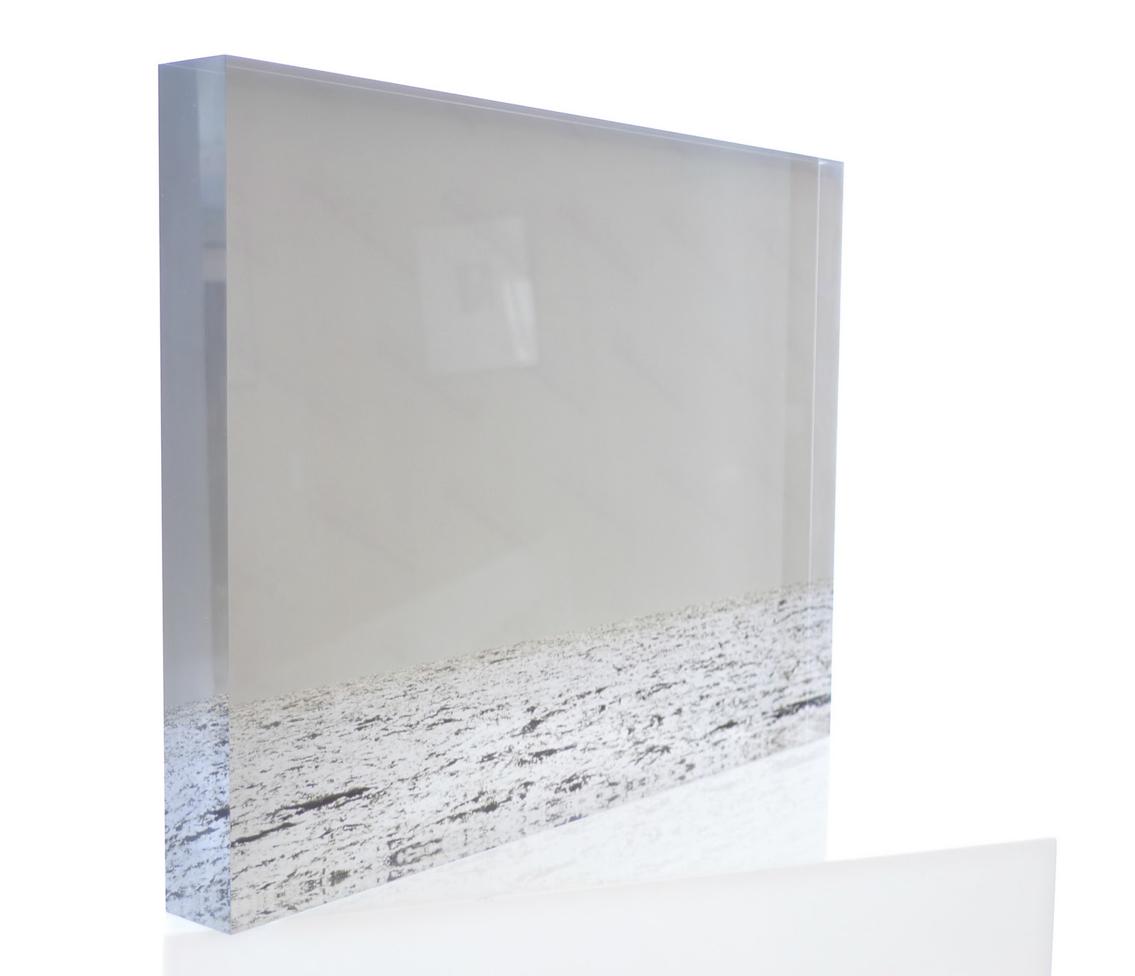
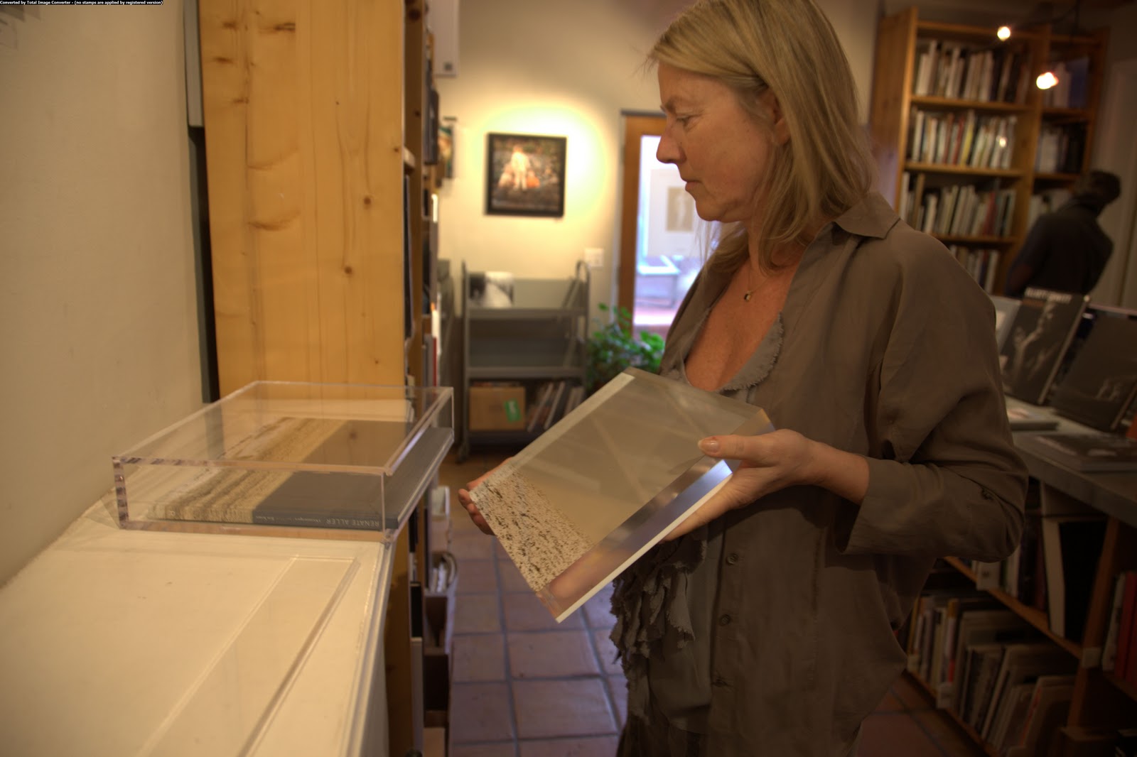
PE:    I'd like to ask you a little more about the book itself.  One of the things that actually drew me to it is that I like smaller prints and smaller books. What made you decide to print the book this way? 

A:    Well, one of the things is probably this advent of digital printing.  Everybody wants to print big and impress with the size and everything.  You know this painter who was played by Max von Sydow in Woody Allen's Hannah and Her Sisters?  He's approached by this rock star who's come into money and he wants to buy something big and colorful - and the painter's very, very unhappy and storms out saying "I don't sell my paintings by the yard."  So, I don't want to impress by the yard, I want to draw the viewer in.  Force them to pay close attention and even the smallness of the size also goes with this small range of tones in the images themselves so they're kind of both designed to produce a more intense, more intimate experience. 


PE:    Yeah, I think that's definitely effective.  Are any of these images a series outside of the book or do you think having it in this book form is critical?

A:    Well, the book form has a certain rhythm to it -- you proceed from one image to the next.  But what I print as a book is not necessarily the set I print as single images.  There are some of my favorite images that are not in the book because they don't fit in the rhythm of the book.  I definitely make stand-alone single prints.  They're a little bigger, but that's mostly just to take into account the greater viewing distance that you have with it on the wall than with the book, but the general mood is the same.

PE:    So at some point do you think there'll be an anonymous showing of these images as well as other images from this Quebec series?

A:    Ah, well, that's not entirely in my control, right?  But definitely if the opportunity presents itself, definitely. 

PE:    You chose to print and bind the book yourself, is this something you think you'll continue to do with other work?

A:    Well, one of the reasons for binding and printing it myself is that that's the only way I could have absolute control over what the book looked like.  And I kind of feel, in this age of the Kindle and the iPad, the only way books can survive is to become more and more bespoke, more and more custom and not the product of a print-on-demand service that gives you a choice of one or two sizes or one or two kinds of papers, right?  So what I have done with this archival ink jet printing upon rag paper, I guess that could be approximated or approached in a trade edition, but it would be hard for me to find a publisher that would want to take on that kind of expense and that kind of risk. And I really love making books - especially the stitching part -- and it lets me attach a personal touch to the work that is only available in maybe darkroom prints - so it's a bit like that.  So, yeah, I really like making the book and I expect to continue doing so in future. 

PE:    Excellent.  It's a very fun book to hold and read through and it does feel very personal in that way, I think because of the handmade attention.  Are you working on another series like the Quebec series or are you planning one?

A:    Firstly, I think the Quebec series - I don't think the series is done yet.  This was the third year I went there and this year I went in one direction as far as the road would take me. And I turned around there.  But there is a boat that goes beyond that because there are still villages, and the only way they can be supplied is by boat.  The boat runs I think ten months of the year or nine months of the year, so one of the things I want to do next year is take one of the last boats of winter.  It runs mid January before it all freezes in and it stops at various small villages and again comes back. One of the things I would like to do is go with that boat and come back with that boat.  And other than that I discovered other things about the place -- there are other extensions of the world that I have seen.  This winter was an unusually warm winter so what I managed to see was what happens in a simulated way --  what happens just before winter sets in or what happens when winter is just leaving. There's kind of a funny in between season where there are patches of snow, patches of grass, patches of mud - and so this in between season has this particular feeling.  That would be another extension of the world.  So these are the other kind of ideas I'm working on. 

PE:    Do you think all black & white still?  Or some color?

A:    No, I think they will be black & white.  It just fits the mood. Color would just be too distracting.
____________________

See Quebec at photo-eye Bookstore.

Read Nicholas Chiarella's review of Quebec in photo-eye Magazine.
War is Personal Photographs by Eugene Richards. 
Published by University of Texas Press, 2010.

War is Personal
Reviewed by George Slade
__________________________ 
Eugene Richards War is Personal
PHOTOGRAPHS BY EUGENE RICHARDS
University of Texas Press, Austin 2010. Hardbound. 240 pp., 102 black & white illustrations, 8-1/2x11".

Damn. Damn. Damn. War in general. This war. This mentality that proposes war as a solution to geo-political conflict.

There aren't many photobooks that leave me in tears. But this one did. From anger, hopelessness, rage, and despair. From my own sense of loss, from caring interrupted. From a desire that everyone who ever voted for combat, or who profited from it, have a copy of this book handcuffed to them as a reminder that big numbers are comprised of scores of individual lives; and from futility, that such a gesture would have come too late, that this powerfully moving book would encounter blind eyes and deaf ears.

War Is Personal, by Eugene Richards. Published by University Of Texas Press, 2010.

War Is Personal, by Eugene Richards. Published by University Of Texas Press, 2010.
Through the specific we comprehend the universal. Through the personal we intuit the generic. But do the generals grasp the meanings of these lives? There are fifteen chapters in this book, fifteen people named and countless more affected in radiating rings around them. The settings range from West Coast to East, from Canada to Kansas City. Some of the names now identify deceased people, some perhaps would be better off dead. All are gruesomely maimed, physically, psychologically, emotionally, or all three. Richards never shies away from the hardest truths; here, his images are sparse and potent, and matched with words that interpret and amplify the damage wrought.

War Is Personal, by Eugene Richards. Published by University Of Texas Press, 2010.
I wish these images, this book, didn't exist, couldn't have been made because the decisions that led to the damage in these lives were themselves never made. Richards' work shows, too forcefully, the costs of waging war. Is it naïve to imagine that photographs can effect change? I hope not, but fear so.—George Slade

purchase book


George Slade, a longtime contributor to photo-eye, is the programs manager and curator at the Photographic Resource Center at Boston University. He continues to post content on his blog, re:photographica. 
A Book of Birds by Stephen Gill

Japanese publisher Super Labo has been on somewhat of a roll in the later part of 2010. Putting out titles by photographers such as Joel Meyerowitz, Todd Hido and Alec Soth is a big achievement from a publisher who has only been around for several years. These limited edition books have been modest in construction and content and, as a photography book collector, they didn’t initially catch my eye. On my first day back from a week long vacation, I noticed a new Stephen Gill book sitting on our counter. The title A Book of Birds grabbed my attention and I have since picked this little softbound up several more times to contemplate the photographs inside.

from the book A Book of Birds
Gill’s study of how birds have adapted their lives to fit around ours is a revisitation to a subject he photographed as a child. Once interested in how birds interacted in his family garden, Gill now has taken to the streets of East London and surrounding areas. The photographs offer depictions of a variety of birds, sometimes these birds standout as the subject of the image, while at others it becomes hard to determine where the birds fit into the landscape. The game of finding the birds in itself becomes an enjoyable part of the viewing process.

from the book A Book of Birds

from the book A Book of Birds

Like previous Super Labo titles, A Book of Birds is modest, only containing 15 photographs… 15 well edited and sequenced photographs. Some of the images are truly beautiful, a testament to however small and simple a project may be, it still has the potential to suck the viewer into a deep visual meditation. The simplicity of the content in this book works perfectly with the modest design aesthetic Super Labo has become known for. This book is a great achievement for this new up-and-coming publisher and has made me excited to see the projects they come up with in 2011.

For purchasing information, click here.


I still remember how excited Jamey was the first time he came in to show us his new project. He had gone on a road trip looking for inspiration when he stumbled upon the construction of this amazing bridge. Stillings first encountered the bridge at Hoover Dam in March 2009, it immediately captured his imagination. After his first encounter he has returned to the bridge again and again until the construction was complete.
The Mike O'Callaghan - Pat Tillman Memorial Bridge (bridge at Hoover Dam) was opened to public traffic at 8:47 pm on October 19, 2010 . An exhibition of Stillings' photographs opens at the Springs Preserve on Oct. 29, 2010 and continues through Jan. 23, 2011. If you are unable to attend this exhibit, you can view Stillings' work on our website.
If you would like more information you can contact me at 505 988 5251 x121 or anne@photoeye.com.


Nirai, Photographs by Manabu Someya. 
Published by Tosei-Sha, 2010.
Nirai
Reviewed by Faye Robson
________________________
MANABU SOMEYA Nirai
Photographs by Manabu Someya.  Tosei-Sha, 2010. Hardbound.  84 pp., 74 color illustrations throughout, 10-1/2x10-1/4".

In one, strangely absorbing, image from Manabu Someya's Nirai, a small selection of clothes hang from the long, makeshift washing line strung across an urban rooftop. These T-shirts, a single sheet and several smaller pieces of laundry - gathered, inexplicably, on a still smaller laundry rack - cluster together in the centre of the large-format photograph, dwarfed by the neglected space around them and the wider context of a dense residential neighbourhood. A neat metaphor for urban anonymity, the photo is also representative of a sub-section of the book where the photographer focuses on small urban spaces, usually devoid of human presence, where the signs of decay or disuse point to ... well, they point to decay and disuse.

The question is, what does any of this have to do with death, or the co-existence of life and death in the minds of these place's inhabitants? The project of this book, as the artist describes it, is to explore the notion of 'Nirai Kanai' - a mythical locale to which the spirits of the dead are said to travel in the culture of the southern Japanese prefecture Okinawa. In the 74 colour images featured here, Someya sets out to visualize this place as it 'co-exists' with the lives lived by real people in the Okinawa region and further south, in Taiwan, Indonesia and the Philippines.

Nirai, by Manabu Someya. Published by Tosei-Sha, 2010.

As Antone Dolezal pointed out in his post about Nirai on the photo-eye BLOG, this kind of spiritual, or at least non-physical, subject matter sits at the limits of what photography can easily communicate, and Someya seems to struggle to find a coherent form for this work. There are images that do successfully hint at the presence of a parallel reality - be it truly mythical or simply psychological. The numinous light that characterizes many of the street scenes included here flattens buildings and objects so that even familiar or mundane sights can seem threatening or unreal.

Nirai, by Manabu Someya. Published by Tosei-Sha, 2010.
Someya is also good at juxtaposing the artificial with the organic, and playing with scale, so that the immediacy of life lived in the modern world is played off against a sense of the scale and rhythms of the natural. A photograph early in the book for example, apparently taken from the back of a passenger boat, measures the distance to the horizon in ever more sparse man-made objects, emphasizing the indifference of the natural world to human life at the same time as referencing the myth of 'Nirai Kanai', often conceived as an island to which spirits fly.

Nirai, by Manabu Someya. Published by Tosei-Sha, 2010.
However, the images often shift gear both visually and conceptually, leaving this viewer at somewhat of a loss as to how to read the work as a whole. A lyrical image showing a water bottle strung high above market stalls is followed by a bright, documentary-style shot of busy city streets, which is followed in turn by blank-eyed portraits of city inhabitants, and then a claustrophobic portrait of a woman sprawled naked on the edge of what seems to be a hotel bed. It is difficult to know how these works are connected, either to each other or the photographer's stated theme; the book can feel 'personal' in the worst way, in that it is almost impossible to penetrate for anyone not familiar with Someya's personal symbolism and preoccupations.

Nirai, by Manabu Someya. Published by Tosei-Sha, 2010.

Of course not every photobook has to make a statement or set out a coherent 'project' - many work simply as collections of beautiful or absorbing images. Someya has set out, however, to document a very particular strand within the cultures of the countries featured here, and we might expect to finish the work sharing something of his connection with the subject. Unable to literally follow his journey (the photos are not arranged geographically or chronologically), it is disappointing that the book doesn't have a more pronounced visual logic. Simply juxtaposing panoramic shots of a city with images of skulls at an undefined burial ground does not automatically give an insight into this region's relation to mortality. —Faye Robson

Faye Robson is an editor of illustrated books, currently based in London, UK. She has worked on photobooks for publishers including Aperture Foundation, New York and Phaidon Press, London.
Last week, Renate Aller dropped off a copy of her limited edition of Oceanscapes 
(shown left and below). Aller is a mixed media artist who has created installation art in the past and this limited edition is no deviation from this genre of art. The limited edition of Oceanscapes contains one of her prints mounted behind one inch thick acrylic giving the illusion of liquidity to the ocean horizon photograph — its translucent illumination is similar to that obtained by a light box. The mounted piece is signed and numbered by Aller in an edition of 25 on the verso with a jeweler's engraving tool and it is housed with a signed and numbered trade edition book in the custom-made acrylic box. The box and/or print can be displayed upright or flat and is a work of art in and of itself. Though several of these have already sold, it is still priced in the first tier of $1800. The next tier is $2600, so don't wait to make an order for this stunning piece (only 2 left in the first tier). Signed copies of the trade edition of Oceanscapes are also available. 

 Limited edition print of Oceanscapes

 Renate Aller with limited edition of Oceanscapes

 Renate Aller signing copies of Oceanscapes 


 Melanie McWhorter with Renate Aller 
and limited edition of Oceanscapes
Each limited edition of Atlanta comes with an 8x10 C-Print (shown with book above), and a handwritten list of Atlanta street names in archival ink on acid free paper.
Many of my friends who review books balk at the idea of reviewing a book from a PDF. I agree that this is often an insult -- you do not review an item solely on imagery -- what is a book if not an object? Well, I am going to break this rule for this pick. I have selected Michael Schmelling's newest book Atlanta based solely on content presented to me as virtual imagery (and the quality of books that I know the publisher Chronicle normally produces). If you are interested in popular culture, hip hop, Southern urban lifestyle or just damn good documentary photos done in a Vice Magazine, flashy (use of flash and glamorous) aesthetic, then this book is for you. Schmelling established his fan base in the photobook world with his 2009 book The Plan, and this new limited edition produced by Schmelling, priced at only $100 (yeah, you read it right) and printed in a small edition of 100 copies, will sell out very fast. Each limited edition also comes with a handwritten list of Atlanta street names in archival ink on acid free paper making each book unique. Check out the images from the book below and reserve a copy here -- of which there are only 99 as one is already reserved for me. ATL, baby!


From Atlanta by Michael Schmelling
 
From Atlanta by Michael Schmelling

From Atlanta by Michael Schmelling

From Atlanta by Michael Schmelling

Atlanta includes photos of hip hop artists, fans and what the publisher calls "the hip hop vitality of the city itself." Along with the images, Atlanta has essays, interviews and, with purchase of the book, access to a download of a "mixtape"of unreleased songs.

Kamaitachi, Photographs by Eikoh Hosoe. 
Published by Aperture, 2009.
Kamaitachi

Reviewed by Sara Terry
__________________________ 
Eikoh Hosoe Kamaitachi
Photographs by Eikoh Hosoe.
Aperture, New York, 2009. 112 pp., 48 tritone illustrations, 9-1/2x12-3/4".


Here's the short version of this review: Buy this book. But if you need to know more, keep reading:

This is the first time Eikoh Hosoe's masterwork Kamaitachi has been priced for the average consumer. The first limited edition of 1,000 copies was published in Japan in 1969 and now sells for thousands of dollars a copy, if you can find it. In 2005, Aperture worked with Hosoe to re-issue the book in another gorgeous limited edition of 500 copies, which now sells for hundreds of dollars.

At last comes this trade edition from Aperture, priced at $60. Beautifully made and reworked by the book's original designer, Ikko Tanaka, shortly before his death, this edition also includes eight previously unpublished pieces from the Kamaitachi series.

The original body of work was made by Hosoe in collaboration with Tatsumi Hijikata, the legendary choreographer and dancer who created the Ankoku Butoh ("dance of darkness") art form. The collaboration between the two men in 1965 yielded an extraordinary record that is documentary in sensibility and dream-like in tone.

Kamaitachi, by Eikoh Hosoe. Published by Aperture, 2009.
 Hosoe and Hijikata used a small village in the Tohoku countryside as the stage for their work, recruiting villagers as their cohorts for a series of images that are both a meditation on Hosoe's longing to capture the land and a fading way of life, and a jarring comment on post-World War II Japan. The title of the book refers to a Japanese mythical beast - a weasel-like creature that slashes its victims with whirlwind ferocity - and Hijikata embodies that writhing, brooding, suggestive presence in each of these frames.

Kamaitachi, by Eikoh Hosoe. Published by Aperture, 2009.
 Hosoe and Hijikata's collaboration with the at times unwitting villagers is by turns playful and ominous, capturing the tension of Hosoe's remembered Japan with the post-war forces that were driving it into a less idyllic time. In one image, at first glance, we see an innocent enough scene of daily life - two women, seated, consulting with a man over some matter, another behind them turned away, a young boy riding by on a tricycle in the foreground, his front wheel just pushing out of the frame. But there in the background is the kimono-clad Hijikata, hands held next to his head, forefingers pointing up, left foot tensed, ready to charge the child in what could be a playful moment. Except Hijikata's face is too sinister, his body too wired, to suggest playfulness; it's an ominous photo.

Kamaitachi, by Eikoh Hosoe. Published by Aperture, 2009.
 The conflicting emotions are captured again and again throughout the book, whether in impromptu moments (Hijikata leaping off a roof, kimono flying above his head, about to land almost on top of a group of children, watching him with quiet alarm) to staged photos of Hijikata with villagers against white backdrops). Among the strongest images are Hijikata in flight across the rural landscape - particularly the last photo in the book, a grainy image of the performer, face upturned to a dark sky, tearing headlong through a plowed field, kimono furling about him, right arm flung back with his hand curling like a claw, his left arm clutching a crying child. The Kamaitachi unleashed, slashing across the rural landscape, the future in its arms.

Kamaitachi, by Eikoh Hosoe. Published by Aperture, 2009.

Essays by Shuzo Takiguchi and Donald Greene, as well as an afterword by Hosoe himself, add depth and context to the work.

I kept the 2005 edition of this Kamaitachi bookmarked on my computer for over a year - hoping that I'd be able to come up with the $500 to buy a copy. I never did. And while I'm still eyeing that edition (which costs even more now), in the meantime, I've got this excellent trade edition to savor.—Sara Terry
Sara Terry A former staff correspondent for the Christian Science Monitor and magazine freelance writer, Sara Terry made a mid-career transition into documentary photography in the late 1990s. Her long-term project about the aftermath of war in Bosnia -- “Aftermath: Bosnia’s Long Road to Peace” -- was published in September 2005 by Channel Photographics, and was named as one of the best photo books of the year by Photo District News. Her work has been widely exhibited, at such venues as the United Nations, the Museum of Photography in Antwerp, and the Moving Walls exhibition at the Open Society Institute. She is the founder of The Aftermath Project (www.theaftermathproject.org), a non-profit grant program which helps photographers cover the aftermath of conflict. She is currently directing and producing "Fambul Tok," a documentary about a post-conflict forgiveness and reconciliation program in Sierra Leone, which recently won a grant from the Sundance Documentary Institute. bosniaaftermath.com
Cranach Series photo-eye Editions portfolio in photo-eye Gallery
Opening tonight at photo-eye Gallery is an exhibition to celebrate the newest publication from photo-eye Editions, Cranach Series by Carla van de Puttelaar.

photo-eye Editions was born just about a year ago to publish contemporary photography in the form of limited edition books and portfolios, seen as a series of art objects themselves. We are committed to extending the aesthetic beauty of photography beyond  the individual photograph, be it in book or portfolio form.


Carla van de Puttelaar

We are excited to announce the newest publication of photo-eye Editions, Cranach Series by Dutch artist Carla van de Puttelaar. van de Puttelaar finished her studies in 1996 at the Gerrit Rietveld Academie. That same year, she won the Esther Kroon award.  van de Puttelaar has participated in numerous exhibitions across Europe and the United States, including Turin, Paris, Groningen and Amsterdam.


The
Cranach Series was inspired by the work of the 16th century German painter Lucas Cranach the Elder, and in it van de Puttelaar creates beautiful and timeless images of women in their natural state. Depicted without makeup and focusing on distinguishing marks like small moles, imprints from lingerie lace or elastic or a slight bruise, these images are, for van de Puttelaar, about real beauty — a human beauty.


This new portfolio contains fifteen full-body nude photographs, a title page, essay, a list of plates and a signature page. Limited to fifty copies, each is contained in an elegant anodized aluminum box. These 11x17 inch pigment ink prints are made on Hahnemühle Photo Rag Baryta paper. 

To view images from this portfolio and to get more information, see the photo-eye Editions section of our website or contact Anne Kelly at 505 988 5251 x121 or at anne@photoeye.com.


Check photo-eye Blog for an interview with van de Puttelaar in the coming weeks.
An Interview with Yoshihiko Ueda on Quinault, Part 2

The conclusion of photo-eye's interview with Yoshihiko Ueda.  Rixon Reed, Melanie McWhorter and Antone Dolezal sat down with Ueda and translator Koichiro Okada at TAI Gallery in Santa Fe NM.  Click here to read Part 1.
____________________

Quinault 14 Courtesy of TAI Gallery
RR:    This is the first time I’ve actually seen your photographs, I was curious as to whether or not the book translated well. I think the book does a beautiful job of reproducing the work – the color, the richness, the contrast, it’s very similar to the actual photographs. My question has to do with when you made the first photograph, and you made a print – do you shoot transparency or negative?

YU:    Transparency.

RR:    So when you first saw that transparency, did it have the same color pallet as we now have in the prints? The same colors, the same saturation, or in making the prints, do you tweak the color some to produce something that is not actual represented in the transparency?

YU:    My printing process is how to recreate the exact same tonality appearing on the transparency.

RR:    So if I held up the transparency it would look similar to the print.

YU:    Yes. Very much so. The original print from the transparency was a dye transfer. 

RR:    But these aren’t dye transfers [pointing].

YU:    No this is not –

RR:    But the original –

YU:    Yeah, the original. These are C-prints.

RR:    From the transparency?

YU:    Yeah.

RR:    Wow. So is the entire body of work also available as dye transfer prints?

YU:    Yes. I made one set. I had an exhibition in Japan of this work and for that exhibition I made dye transfer prints.  I only made one set of this series in dye transfer. Because the very first print was dye transfer, which I was very satisfied with, when I decided to make the C-prints I had a little fear, “Can I come close to this?” My goal was to make a print as close as I could to the first one, however, when I placed the two next to each other, I feel that the C-print comes closer in expressing my original sensation, the original color of what I saw and experienced in Quinault. So I’m more happy with the C-prints. 

RR:    How interesting. Now, these prints are only available in this size, is that correct? 

YU:    Each image has two sizes available. The smaller size was the original size of the dye transfer.

RR:    When was the original exhibition of this work?

YU:    The year following taking these photos… I believe 1992.

RR:    So shortly before the publication of the book. And is this the first exhibit of this work in this country?  In the United States? 

Yoshihiko Ueda
YU:    Yes, yes. 

RR:    Wow that’s surprising. 

MM:    I know. The other exhibit that was the first in Europe, that was recently too.

YU:    Yes.

RR:    Michael Hoppen Gallery, that’s your first exhibit of this work in Europe? 


YU:    In Europe, yes.

RR:    Wow. Why do you think it’s taken so long to gain recognition?  The work is so beautiful and I would think that shortly after the publication of the book there would have been exhibits or interest in the work. Perhaps it’s because you were not known in the country or in Europe and it’s taken this long to finally become better known?

YU:    I don’t know the reason why it took so many years for me to have these over seas shows. I some how feel that it’s part of special domestic reasons in the Japanese photo world. If a Western photo artist does an exhibition in one city in Europe, if the exhibition is well received it will probably go to the next place much more easily. But somehow in Japan the information does travel that fast outside of Japan. I also didn’t make an effort, which might be part of the reason.

[Laughter]

Even with this long gap between my first show and the recent three shows, it was also interesting that I got approached by two men, Mr. Robert Coffland and Mr. Hoppen almost at the same time from the United States and Europe. I thought that was strange.

Quinault 31 Courtesy of TAI Gallery
AD:    Had both seen the prints on the wall in Japan when the approached you?

YU:    I had heard that Mr. Hoppen had had my Quinault book and had been thinking about it for a while and saw a Quinault photo at a friend’s home and that’s when he got really interested in it.

AD:    I think that it’s really interesting that he viewed the work from the book. When I view the prints I get encapsulated with each print individually and each portrait of the tree -- I can completely get sucked into the image. And when I look at the book I have much more of an understanding of your experience as a whole because it flows very well as a series in the book. With the images I have a different experience. How do you feel about the way the work is presented in the book compared to how it’s presented in prints or an exhibition?

YU:    I agree with you. When I made the Quinault book it was my intention to have the viewer share the same experience that I had in the rainforest.  With a show like this there are spacial limitations so I cannot use all the photos and I have to select the work. I want the viewers to be face to face with each one, to feel the energy of each one.

MM:    It seems like this is the beginning and this is the end [pointing]– are they laid out chronologically in the exhibit or in the book so that it somewhat mimics what you experienced?

Koichiro Okada, Rixon Reed, Melanie McWhorter,
Yoshihiko Ueda and Antone Dolezal
YU:    When I was selecting which work should go on which wall, I wasn’t really thinking of it in a chronological way, however, it just happened that way. This was placed here at the beginning [pointing] and this ended the exhibition [pointing]. Even though I was not thinking of it, I feel like that was the way it should have been.  There was some kind of special energy that made the installation happen that way. 

RR:    So just to be clear, you were here for the hanging of the show and you helped order the show?

YU:    Yes, it was my decision.

RR:    That you very much, that was delightful!

 ____________________

See information, description, and images from the Quinault book here.


Opening a Raymond Meeks book is like opening a treasure from a poet, an artist, an eccentric friend-of-the-family. This little gem, who will stay, is simply bound in printed paper boards modeled on 1970s wall paper. As each layer opens beneath your fingers, you discover photos, poems and a handwritten letter. 

Raymond Meeks puts his heart into every project -- each book is a cathartic experience, purging the bad while embracing the good. who will stay is the third book in a trilogy -- following carousel (now out-of-print) and amwell, continuum -- and the exit for Meeks' recent journey. The images in this volume represent salvation, rebirth, transition and, literally, the fallow ground waiting for the spring planting. The modesty of the imagery shown in the plates extends to the price, as each edition is so reasonably priced that its cost does not truly represent the value, worth and pleasure attained by viewing this book. 

Read the poem that accompanies who will stay on the citation page and read Daniel Espeset's small review in the photo-eye New Arrivals Newsletter.


Raymond Meeks' who will stay 
(shown with matted silver-gelatin print)
Interior image of who will stay